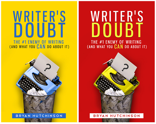
Book cover design is not rocket science.
It’s simple: You need a cover that instantly grabs one’s attention and describes what the book is about in a single glance.

Pretty simple. Perhaps, perhaps not, but authors, especially self-published authors like me, well, we screw-up our book covers all the time. My first cover for “Writer’s Doubt” was a failure. Allow me to explain why it was a catastrophe and why the new cover works like magic.
Authors tend to make terrible book cover designers.
(Tweet that, if you like.)
There, I said it!
A few writers are talented at creating their own book covers, of course, but I’m not one of those few. And honestly, most self-published authors are in the same boat, but too many of us stubbornly design our own covers anyway. And we suffer the consequences for it.
The worst part is we spend years honing our book’s content to what we consider perfection, or as close to it as we can get, but too many of us refuse to spend as little as $200.00 on a professional cover design?
After all, if we can write such outstanding, ground breaking, brilliant books, then naturally we can create the perfect covers for them too.
Right?
Wrong.
Sorry. I hate to break it to you, but if you’re not a professional designer and marketing expert, then you’re not the right person to create a book cover for anyone. At most you can describe what you would like, but the designer needs to take your idea and make it work as an actual design that converts into sales.
Blunt, I know, but I wish someone would have dumped cold water over my head before I thought I could design my own covers and get away with it.
Honestly, a post like this would have fallen on deaf ears if I had read it a few years ago, but I’ve changed and I’ve come to realize the value of professional design.
So why was the first cover for “Writer’s Doubt” a failure? Because it was passive and forgettable. It didn’t make a statement that demanded to be noticed.
A remarkable book cover design must make a statement that demands to be noticed!
(Feel free to tweet that)
Don’t get me wrong, “Writer’s Doubt” has sold remarkably well even with the first cover, the book’s content itself generated buzz. But for the uninitiated, the cover had little to no impact. And that’s not good.
And that’s why I contacted Ana of books-design.com.
But I’m getting ahead of myself. Before I decided to update the book’s cover I noticed another problem. The subtitle needed work.
Again, it’s crazy how much work we put into our book’s content and then not enough consideration to the cover and even, the subtitle.
The subtitle is just as important as the title and the cover, if not more important.
The subtitle is important because:
1) It explains explicitly what your book is about.
2) It distinguishes your book from the millions of other books already on the market.
3) It generates further interest and helps compel the potential reader to decide to purchase.
The original subtitle for “Writer’s Doubt” failed because:
1) It repeated a word from the main title. How You Can Overcome Doubt and Create Work That Matters
2) It was obvious and forgettable. Which is to say…
3) It did not define the book enough and distinguish it from other books about overcoming the doubts we have as writers.
The new subtitle wastes no words and is explicit.
Main Title: Writer’s Doubt
Subtitle: The #1 Enemy of Writing (and What You Can Do About It)
Enemy is a memorable (and accurate) word, which replaces the repeated “doubt,” furthermore the subtitle explains the book will reveal what you can do about the #1 enemy of writing.
It’s an impactful and practical subtitle. The casual passersby are more likely to remember it. I cannot take credit for the subtitle, though. The credit goes to my friend, Jeff Goins.
The problem for most writers is that we need other people to help us with our book’s title, subtitle and cover, and yet we end up trying to do all of it ourselves to:
1) Save time, 2) Save money and, 3) Because we believe our ideas and skills are “good enough.”
Shame on us.
And I mean that in the most compassionate way. Our books deserve superior treatment from professionals in each of their specific expertise and therefore our books will have the best opportunities in the marketplace.
Now let’s get back to the cover.
Once I had the subtitle I contemplated what would a doubtful writer be liable to do if utterly frustrated?
Break her pencil?
Throw his pen across the room?
Those are typical (and temporary) responses to frustration, but not quite as dramatic a response necessitated by our true and formidable Writer’s Doubt.
How about a typewriter thrown in the trash? What crazy writer would do that? A sincerely frustrated writer at his or her wit’s end.
C’mon, you know you’ve been there and so have I. We identify.
Now we’re on to something. I sent my idea to Ana along with a mockup of the design. What she sent back shocked me!
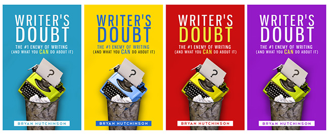
She sent me the typewriter in the trash on colors I never imagined, bright and shiny, and would get anyone’s attention whether they’re a writer or not.
At first I rejected such bright, bubblegum colors. I was appalled. Indignant! I was a serious writer with a serious message and I needed a serious cover.
But wait a minute, I already had a serious cover, it was low key, respectful and appeasing. Oh, right, that’s why it failed! Cold water. On face. Thank you.
Okay…
With several colors to choose from this presented yet another conundrum. What color should I choose?
Ana’s suggestion was red. After all, two of my instructions were to make it interesting and above all, memorable.
But I wasn’t sure. The choices overwhelmed me. Dammit, Jim! I’m a writer not a designer!
Both the yellow and the red held my attention the most, so I uploaded those to an online writing group and decided I would let the majority rule. But…
Something interesting happened.
The covers were so interesting they received well over 100 comments within a couple days!
Yellow was the clear favorite with over 70% voting for it. Yellow garnered responses such as, “It’s nice.” – “It pulled me in.” and “It’s pleasing to the eyes.”
But… (I told you there was a, but…) Red did not get as many votes, but the responses it received were far more dramatic! It received responses such as, “Red symbolizes ‘stop.’ Therefore, stop doubting and overcome.” – “I vote red. My eyes can’t not choose it over the yellow.” – “The red is kind of scary!” and many other lively comments.
The red cover generated responses beyond simply making a color choice. It EVOKED EMOTION and vivacious discussion.
The comments for red were interesting and memorable. Commenters were not simply pleased. No, they were INSPIRED by the red cover, even if it was sometimes in a “scary” way, as a few commenters put it.
And that’s why I chose the red cover, even though I too began to favor the yellow, and that’s also what makes it work like magic. Good, bad or ugly, it generates an emotional connection.
Love it or hate it, you’re far more likely to remark on the red cover and, more importantly, remember it.
That’s what you want in a cover design. You don’t just want to convey your message and call it a day. No.
What you want is for your cover to leave a lasting impression in such a way that it continues to impress itself long after it’s passed from sight.
Let’s be honest, covers rarely are successful enough to be remembered, most covers are average and merely pleasing to the eyes and “nice,” but if you can get a cover to cause a person to love it, hate it, want it, need it, or utterly reject it, well, then you’re on to something.
And to do that. To create such an impactful cover. You may need to spend the couple extra dollars that your book deserves and hire a professional designer.
But before you spend your hard earned money…
2 things you should have ready before hiring a designer:
1) Describe your entire book in one, single, solitary, sentence. That’s very difficult for us as authors, but we must hone the description to one all encompassing sentence.
If you’re fortunate the sentence will become your subtitle, but that’s not its goal. The goal of this narrative is to give the designer a focus. To allow her to understand your book as a casual book browser might.
2) Pick the best possible image to present your book.
Consider your perfect readers and ask yourself what would make them “FEEL” something when they see your cover. They don’t need to feel good or happy (or pleased), and they don’t even need to “like” your cover per se, but it’s imperative that they “feel” something.
If you have your single sentence and single image figured out that will save you time and money. These two items are the most vital and the most difficult parts of the entire process, so… take… your… time and figure them out.
The perfect cover?
You might think I am convinced the red cover is perfect. I’m not. It could end up a dud.
I don’t know. Not yet. And that’s normal. You never know how something is going to succeed in the marketplace until you try it. It could be a hit or it could be a miss, but those are the risks we take as writers who practice in public.
I’m going to give the red cover a shot for 3 months and if I don’t see any difference in sales then I’m going to give the yellow cover a try for the following 3 months.
That’s one of the benefits of self-publishing. We can change, modify and update our covers anytime we want. It’s fun like that!
However, we have to keep in mind that the book cover is the device to get people to “look inside” and it’s important that what they find inside is the best you’ve got to offer!
Be awesome.
So which cover will YOU remember? Share in the comments. I’d love your feedback!
(If you like, view the new cover on Amazon.)


