I wanted to create something different―something special, a cover that tells a story in motion. You see animated images on social media all the time, so I thought why not create an animated cover for my new book? I didn’t realize it would cause such a ruckus. But hey, that’s what marketing is all about, getting people to take notice.
Here’s how I did it and you can, too!

Think about it, you work on your book for years, perhaps even decades, and yet you’re forced to do your best to sum up the entire story in one single, static image. Not anymore!
What if you could create a moving story on your book’s cover?
I did exactly that with my most recent book Serious Writers Never Quit, and since posting it on Facebook, and in my sidebar here on Positive Writer, I’ve received a tremendous amount of inquiries as to how I did it.
Before we get to the creation steps, here’s the result that’s causing all the ruckus:
(What’s also cool about this animated cover is that even though it’s in motion, it’s still possible to add a link to a sales page just as you would to a static image, such as a jpeg or png. Click on it to see it in action!)
Let’s Get To The Gif Of It
You see animated gifs all the time on social media, especially on Facebook. So why not make a book cover gif?
This isn’t exactly new, but almost all of the current gif book covers are gimmicky and do not take the time to tell a real story. You don’t want to create a forgettable gimmick if you can help it. I’ll explain what I did to try and avoid this problem.
First, it’s a good idea to understand how this works. A gif is basically several images on top of each other in one file that gives the perception of a single moving image. It’s like a flipbook.
In order to create an animated book cover, you’ll actually need about 5 to 10 individual covers. Don’t worry, though, it’s easier than it sounds.

The Design Steps
Usually, I hire a professional book cover designer, but for this experiment, I decided for my own sanity, and the sanity of whomever I would have hired, I should try this myself first.
1) Tell A Clear And Compelling Story
The story should be able to be told with as few images as necessary and should clearly visualize what the book is about with as little guesswork as possible on the viewer’s part. This is what separates the forgettable from the memorable.
The story I decided on is, well, what the book is about:
A writer becoming serious about (his or) her writing and in order to do that she must discover The Way to awaken the warrior within. Warriors have a mindset that drives them to achieve their goals. This book is about that mindset.
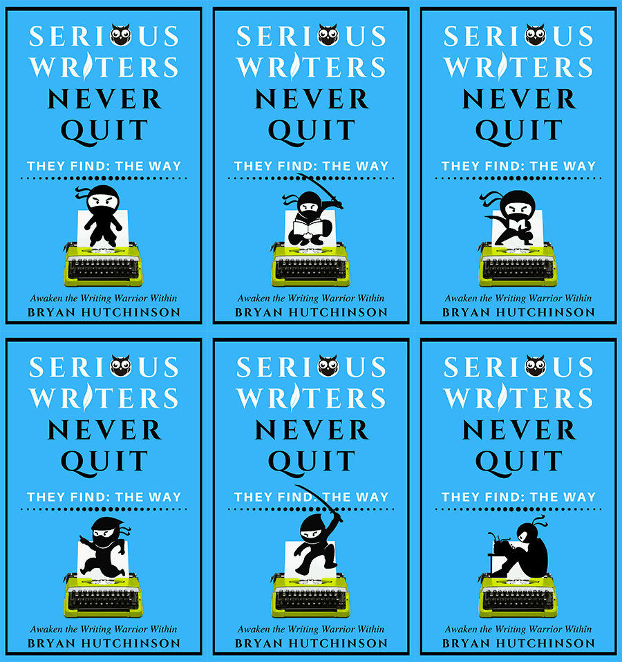
That’s a serious story and needed to be broken down into simple steps. I originally had 10 individual covers and finally got it down to 6.
Cover 1. A writer ready to make the all-important mental shift all of us writers must eventually come to make: Quit or take our writing seriously!
(Click images to see larger versions.)
Cover 2. Again, like the rest of us, she’s not exactly sure how to go about it at first, so she finds a manual (ahem, Serious Writers Never Quit).
Cover 3. She finds The Way. (The Way isn’t too complex to learn for anyone, but what makes it scarce is that not everyone takes the time to learn what it is and how to use it. So those who do, they gain the edge and become more enthusiastic about their work.)
Cover 4. Now that she understands The Way, she chooses her new direction with great enthusiasm!
Cover 5. She’s getting very serious and will attack her writing with her newfound way of being a writer, an artist, and if I dare say, a person. She’s becoming a writing warrior and nothing and no one will stop her now!
Cover 6. She is now a serious writer, armed with The Way, who will never quit!
2) Keep It Simple
I figured if I am going to do this on my own I would need to keep it as simple as possible. Simple stories often work best. No one wants their brain fried. Better designers can get more complicated, but for a novice like me, simple was best.
3) Pick Images That Go Together, Preferably In A Series
The best option, I think, is to purchase from stock photo sites to ensure you have the licenses you need. This is an example of what I downloaded from depositphotos.com:

4) Choose The Design Tools
I used Canva.com. This design site is super easy to use and has great templates to start with. You can also easily import your own images. What I like about Canva is that I didn’t need to learn a lot because it’s straight forward and it’s not cluttered with adverts and other nonsense.
5) Create A Basic Template
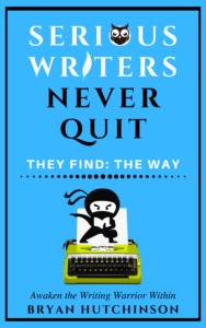
If you look at the below cover, I used the same typewriter that is used in the logo for my website Positive Writer and is also used on the cover of my previous book Writer’s Doubt (did you already guess that?). Thus I have continuity between my website and my books. The text and other elements I created from within Canva.
The cover is minimalist. Indeed, it looks simple, but I assure you it cost me hours and hours of tweaking. The simpler something looks the harder it was to make. If you find you’re having a difficult time of it, don’t worry, it’s normal.
Canva has many basic designs you can start with; however, I recommend you customize, customize, customize or you’ll end up with something thousands of others are using too.
6) Create (Or Choose) The Main Book Cover
Even though we are creating an animated book cover, you will still need a main static book cover for any site that does not yet allow animated book covers. Also, if you’re going to make a print copy you’ll need a static cover.
One of the cool things about any of the static images for Serious Writers Never Quit is that any one of them could serve as the main cover!
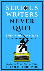
Here’s the one I chose to use on Amazon as the main cover:
7) Use A Software Program To Create A Gif
Once you have your design ready, download each individual cover and load them into a gif creation software program. Does it sound too easy? It really is that easy.
I used SSuit Gif Animator. It’s a free software program and you can download it here. SSuit Gif Animator is extremely easy to use and allows you to customize the timing between images as well, it will even resize the gif as per your needs. One recommendation I make is that you number your covers in the order you want them to be in the animation. Then load them into the software and click create, the gif animator will do the rest!
There are also several websites that specialize in creating animated gifs for you for free. However, a word of warning, some of those websites put their logo on it. I recommend creating using stand-alone software.
10) Upload It To Social Media And Your Website
Once your book is published and you’re ready to share the animated book cover, upload it to your favorite social media websites and post it on your author/book website.
The MYTHs
Don’t let any myths stop you!
There’s a myth that you should only have one book cover. And another myth that if you have multiple covers for the same book it will hurt sales. But these are simply not true!
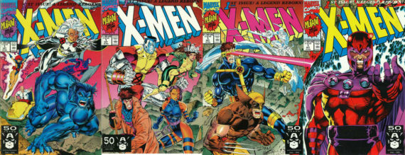
Look at what Marvel did by creating several different covers for X-Men #1 (1991) below:

X-Men #1, with multiple covers for the same issue, is in The Guinness Book of World Records for best selling comic book of all time! So, there’s that!
Or, look at studios that create several different posters for the same movie.
OOPS! Marvel did it again! With what now is the #1 Box office hit of all time, Avengers Endgame!

That’s It!
With a bit of luck, and hopefully a compelling design, your animated book image might even go viral!
Viral or not, it’s still a cool and fun marketing strategy. It’s cost-effective too. Aside from the images I purchased, the rest was free. If you hire someone to do this for you, it could cost hundreds, even thousands, so consider costs if you want to have a professional create it. I highly recommend trying it yourself first. Canva really is that easy. After all, I am by no means a designer!
If you find yourself getting good at creating your own covers and you’ve self-published, go ahead and get even more creative and design separate covers for holidays and other occasions, if you like. There are so many options.
Since it’s almost Halloween, here’s a poster I created for the season:
(Click to enlarge)
And, of course, we have an animated version for Halloween as well. I can’t stop watching it because the cat totally cracks me up (every now and then I have a fun idea)! I’m already thinking up things I can do with the Christmas version.
There you go! Now go and create your own animated book cover.
If you do create your own animated cover, feel free to leave a link to it in the comments. I’d love to see it.
Chance To Win
If you haven’t read Serious Writers Never Quit yet, here’s the link to it on Amazon. Once you read it, consider reviewing it and enter a drawing I set up where you can win an Amazon Gift Card and/or an Amazon Fire Tablet!
Click here for how to enter the drawing.
Good Luck and Happy Reading!


